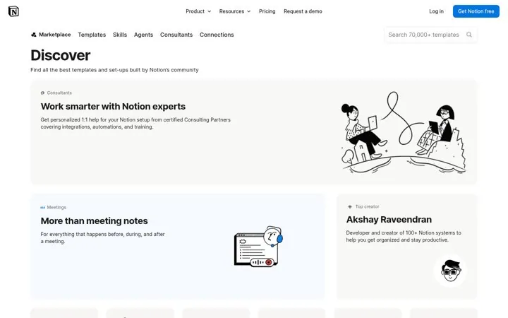
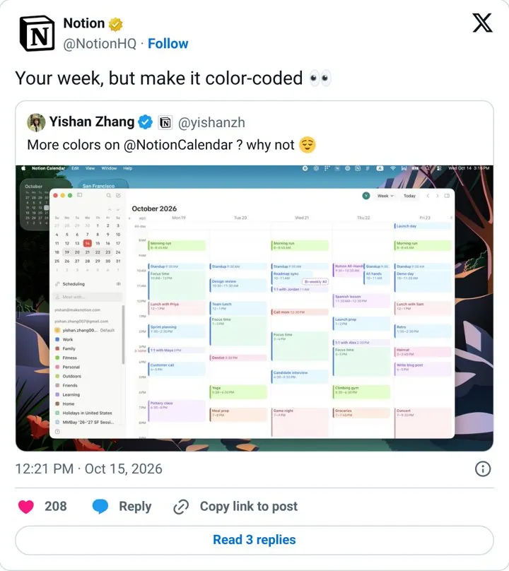
| Notion | Sell the template by showing it in use | It reads like a friend sharing a setup, not an ad, and the visual does the selling. |
| Notion | Turn your users into your catalog | Every template made by a user becomes a new door into the product. |
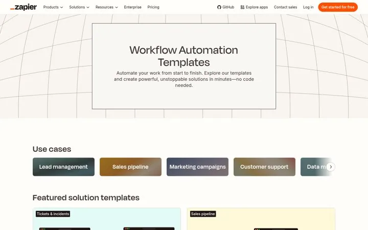
| Zapier | Sort templates by the job to do | People find the job they need instead of browsing features. |
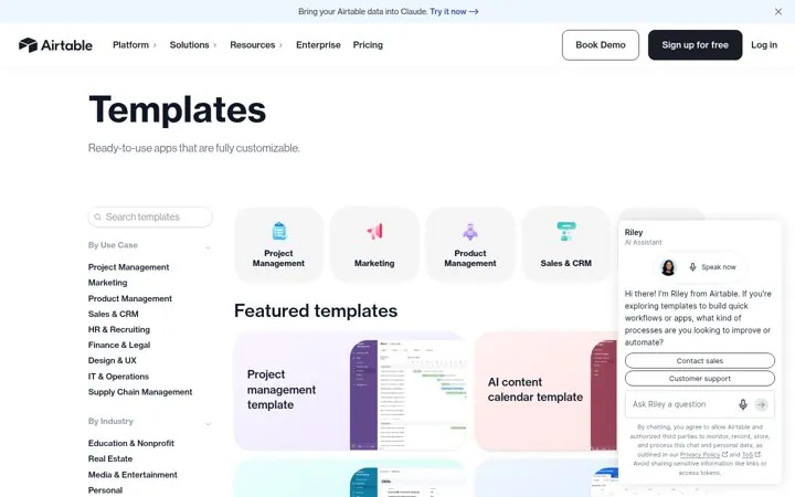
| Airtable | Offer ready to use apps | Calling a template an app makes it feel like a finished tool. |
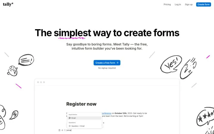
| Tally | Say free and no signup in one place | Removing sign up from the first step gets people building right away. |
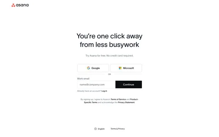
| Asana | Promise the outcome above the form | The headline sells the result, not the account, and one click away makes the form feel like the last step instead of the first. |
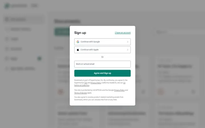
| Grammarly | Show the product behind the signup form | Seeing the app behind the form makes signing up feel like opening a door that is already there, not filling out a request. |
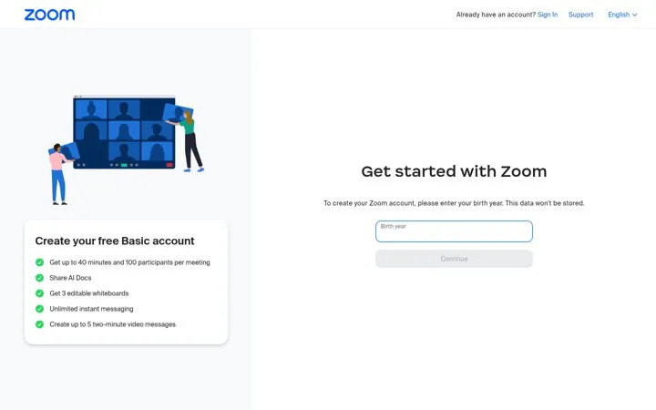
| Zoom | List exactly what the free plan includes | A precise list of limits sets the right expectation, and the 40 minute cap quietly tells heavy users where the paid plan starts. |
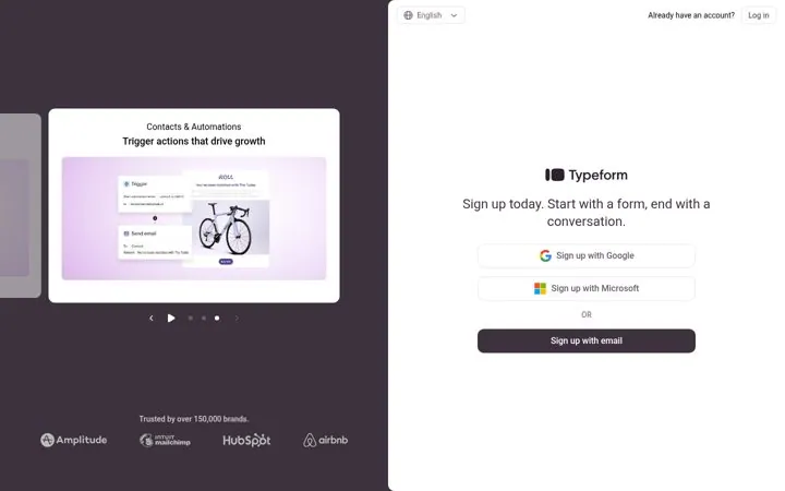
| Typeform | Rotate product slides beside the form | Each slide sells a different reason to sign up, so the page reaches more people without making the form longer. |
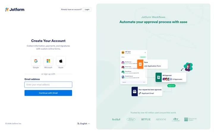
| Jotform | Back the form with a big user count | A huge user count says the tool is safe to try, and cycling product lines shows new users there is more than forms. |
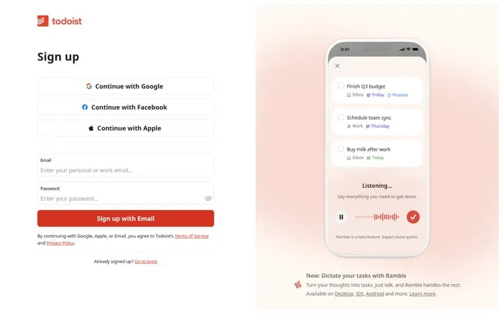
| Todoist | Animate the product next to the form | A moving demo shows the product working before the account exists, so people sign up to try something they just saw. |
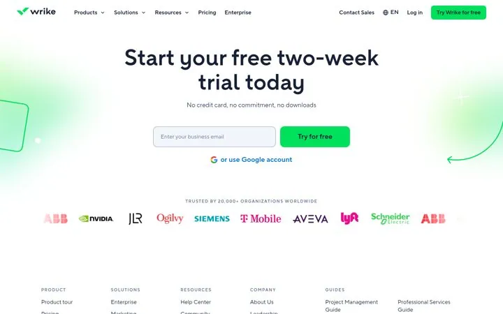
| Wrike | Remove three objections in one line | Card, contract and install are the three reasons people skip a trial, and one short line clears all three. |
 Notion