 Klaviyo
Ask for one field first
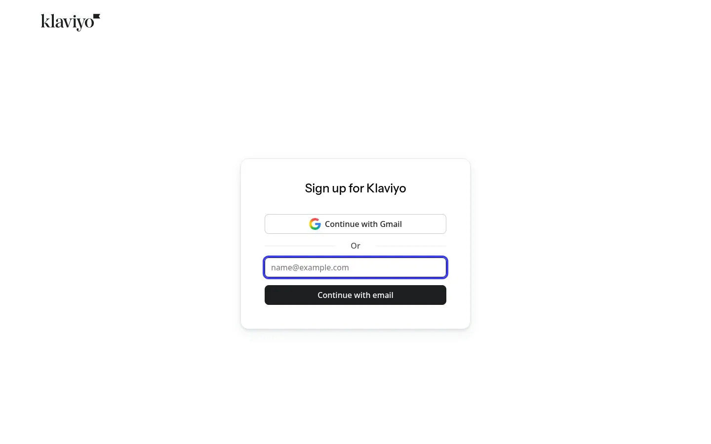
Klaviyo's first screen is Sign up for Klaviyo, a Continue with Gmail button and one email field. Every other question waits for later steps.
Screenshot klaviyo.com/sign-up, Oct 22, 2026 · How to copy it
Real marketing from startups and B2B SaaS brands that is working right now, picked by hand.
Click the link we just sent to confirm your email.
Free. Unsubscribe in one click.
A good SaaS signup page asks for as little as possible on the first screen, answers the price, card and time questions next to the button, and shows the product or a result beside the form. The twenty signup and free trial pages below come from Klaviyo, Zendesk, Shopify, Asana, Zoom, Pipedrive, Wrike, Sentry, Semrush, Clerk, Grammarly, Netlify, Typeform, Jotform, Todoist, Buffer, Postman, MongoDB, Freshdesk and MailerLite. All were captured Oct 22, 2026, and each links to the live page.
Updated · By Blake Emal
KlaviyoKlaviyo's first screen is Sign up for Klaviyo, a Continue with Gmail button and one email field. Every other question waits for later steps.
Screenshot klaviyo.com/sign-up, Oct 22, 2026 · How to copy it
 Zendesk
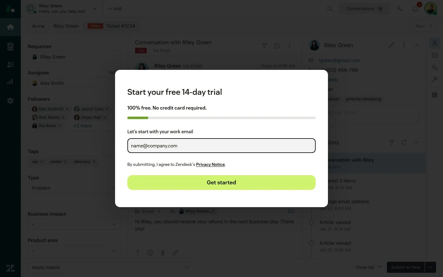
Zendesk opens Start your free 14-day trial with a progress bar and Let's start with your work email, over a dimmed live agent workspace.
Screenshot zendesk.com/register, Oct 22, 2026 · How to copy it
 Shopify
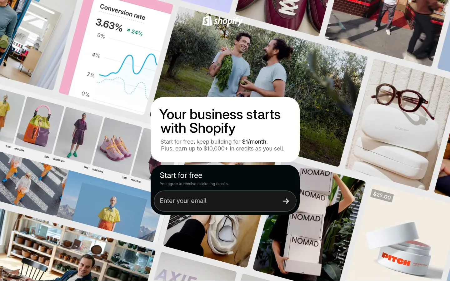
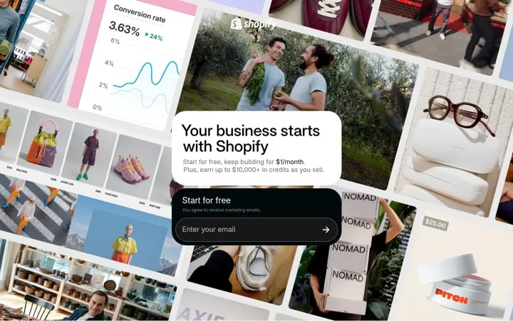
Shopify says Start for free, keep building for $1/month and Plus, earn up to $10,000+ in credits as you sell. The next price is on the page before anyone asks.
Screenshot shopify.com/free-trial, Oct 22, 2026 · How to copy it
 Asana
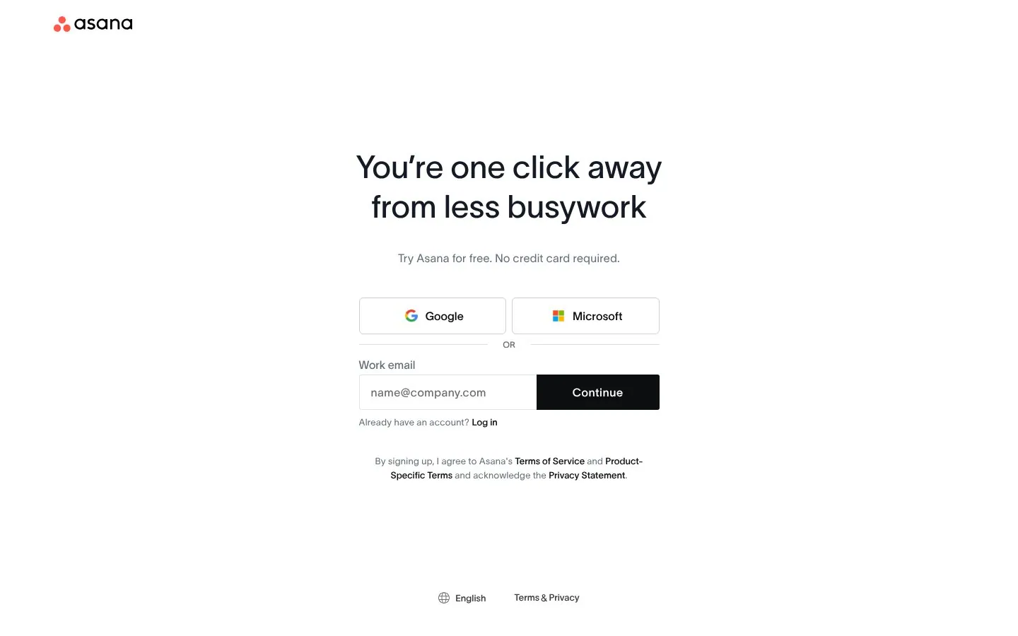
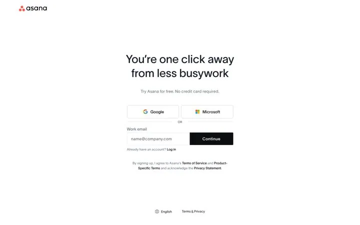
Asana's headline is You're one click away from less busywork, with Try Asana for free. No credit card required right under it.
Screenshot asana.com/create-account, Oct 22, 2026 · How to copy it
 Zoom
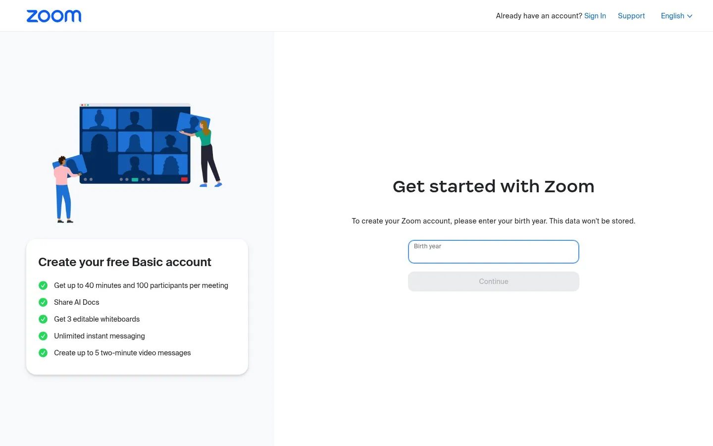
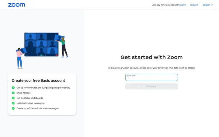
Zoom lists what the free Basic account includes, starting with up to 40 minutes and 100 participants per meeting, beside the form.
 Pipedrive
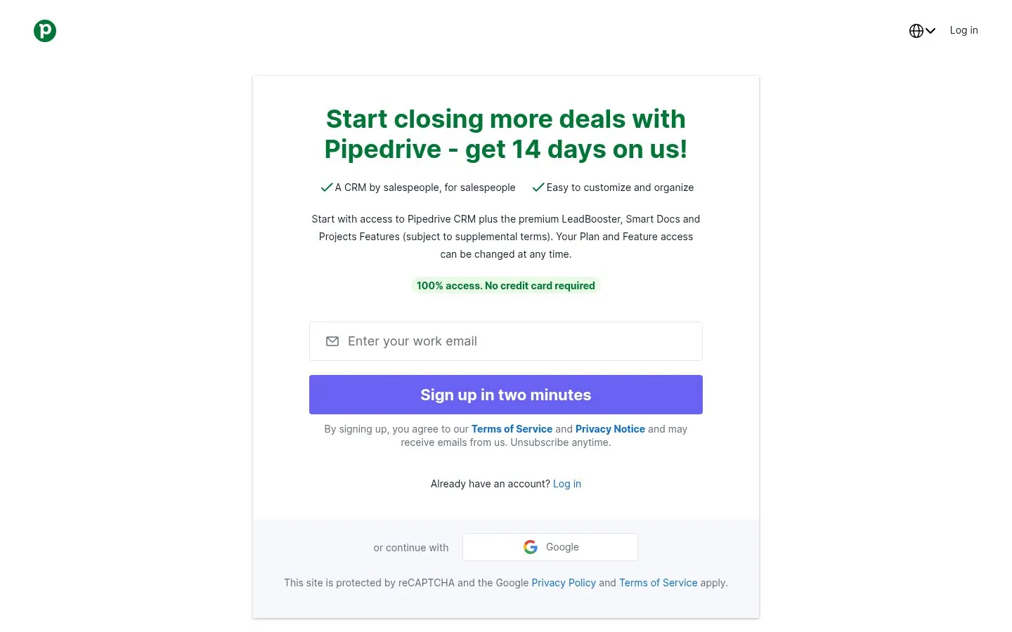
Pipedrive's button reads Sign up in two minutes, under a 100% access. No credit card required badge.
Screenshot pipedrive.com/en/register, Oct 22, 2026 · How to copy it
 Wrike
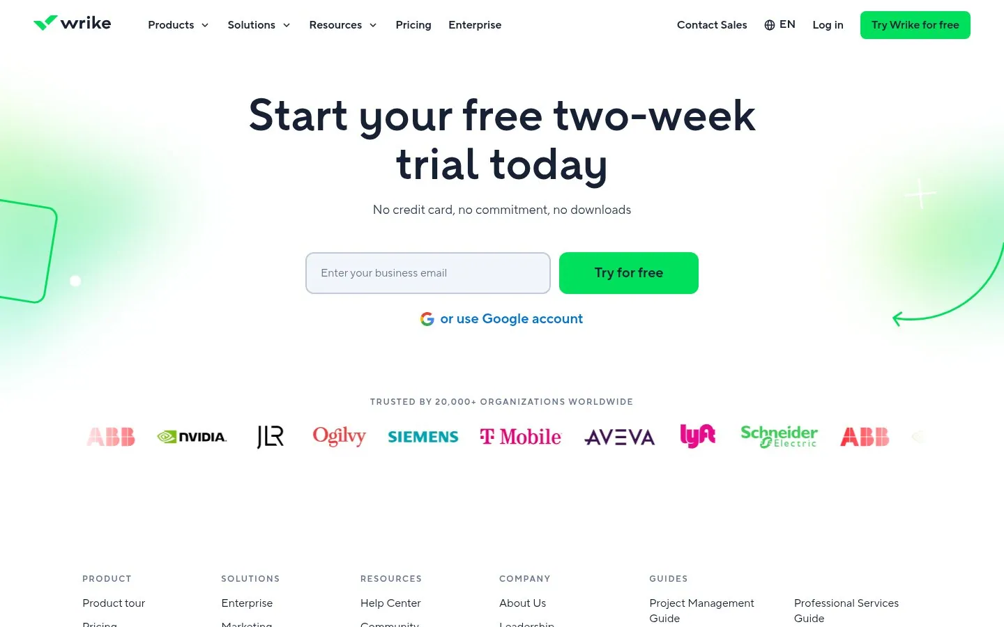
Wrike clears three objections in one line, No credit card, no commitment, no downloads, then shows Trusted by 20,000+ organizations worldwide.
Screenshot wrike.com/free-trial, Oct 22, 2026 · How to copy it
 Sentry
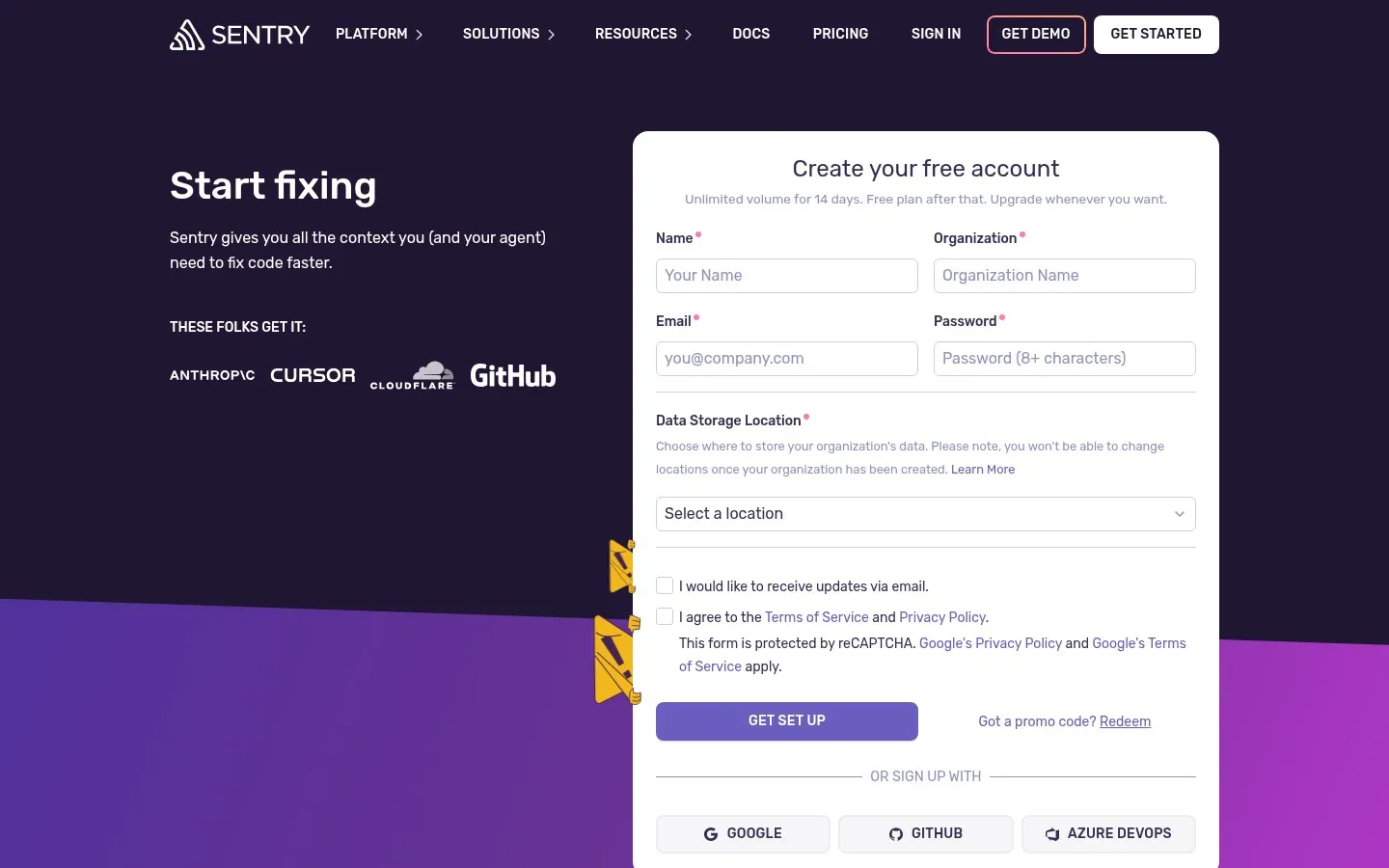
Sentry's form says Unlimited volume for 14 days. Free plan after that. Upgrade whenever you want, so nobody fears a surprise bill.
 Semrush
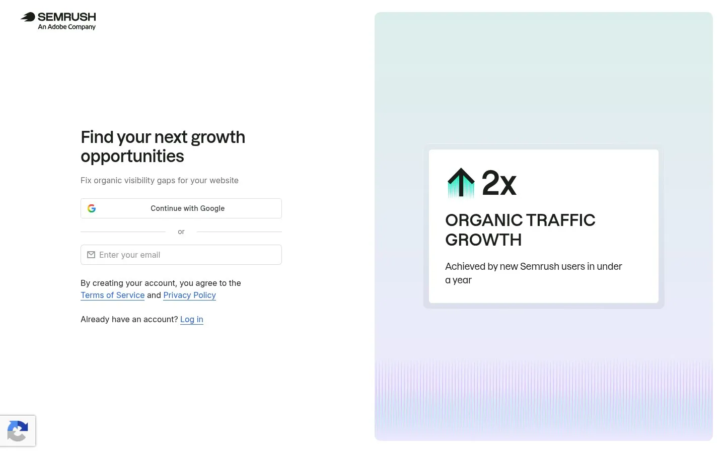
Semrush pairs Find your next growth opportunities with 2x organic traffic growth achieved by new Semrush users in under a year.
Screenshot semrush.com/signup, Oct 22, 2026 · How to copy it
 Clerk
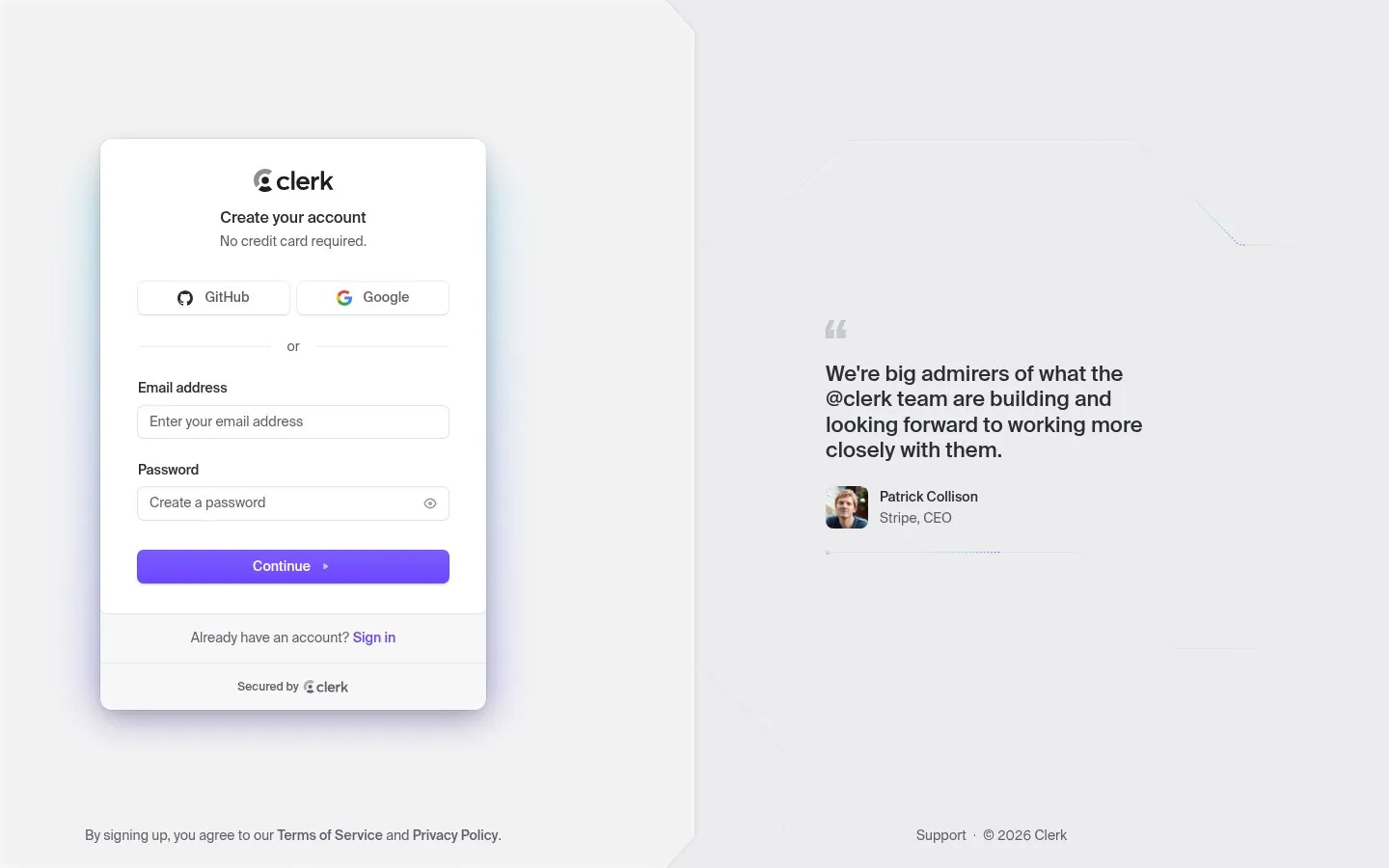
Clerk puts a quote from Stripe CEO Patrick Collison beside a form that says No credit card required.
Screenshot dashboard.clerk.com/sign-up, Oct 22, 2026 · How to copy it
 Grammarly
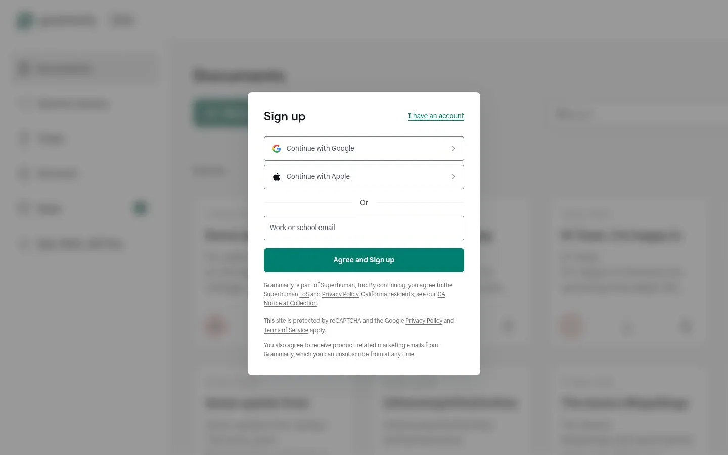
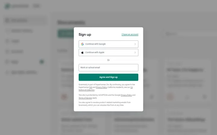
Grammarly centers a short Sign up box over a blurred view of its documents app, so the product is visible before the account exists.
Screenshot grammarly.com/signup, Oct 22, 2026 · How to copy it
 Netlify
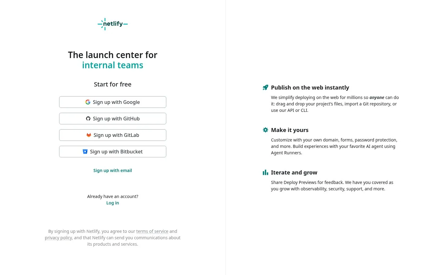
Netlify's headline The launch center for cycles through first-time builders, internal teams, global brands and solopreneurs.
Screenshot app.netlify.com/signup, Oct 22, 2026 · How to copy it
 Typeform
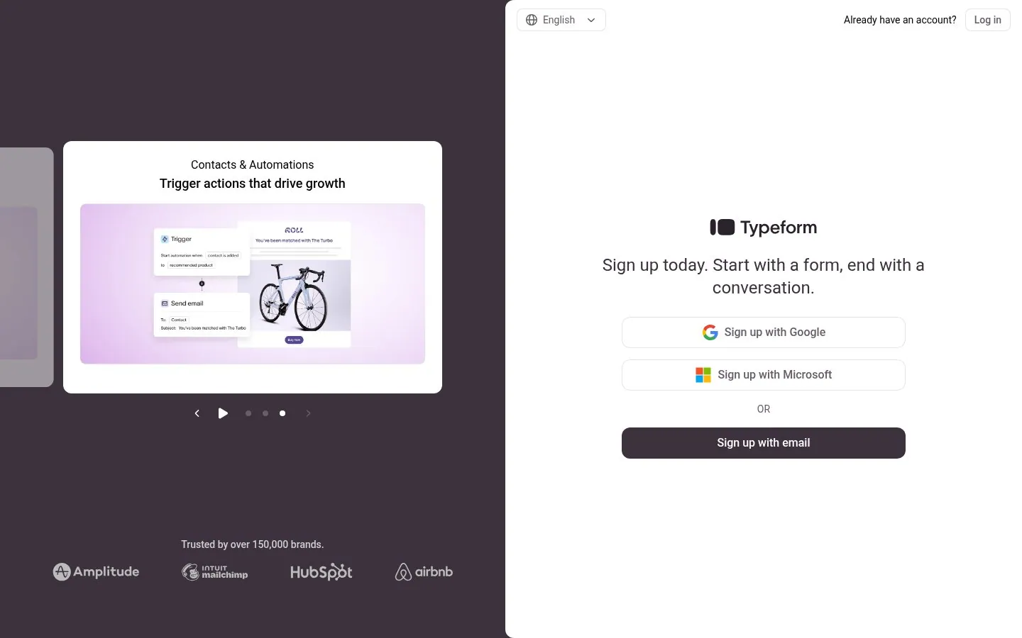
Typeform runs a carousel of product slides beside the form, including Get up to 3.5x more responses and Trusted by over 150,000 brands.
Screenshot admin.typeform.com/signup, Oct 22, 2026 · How to copy it
 Jotform
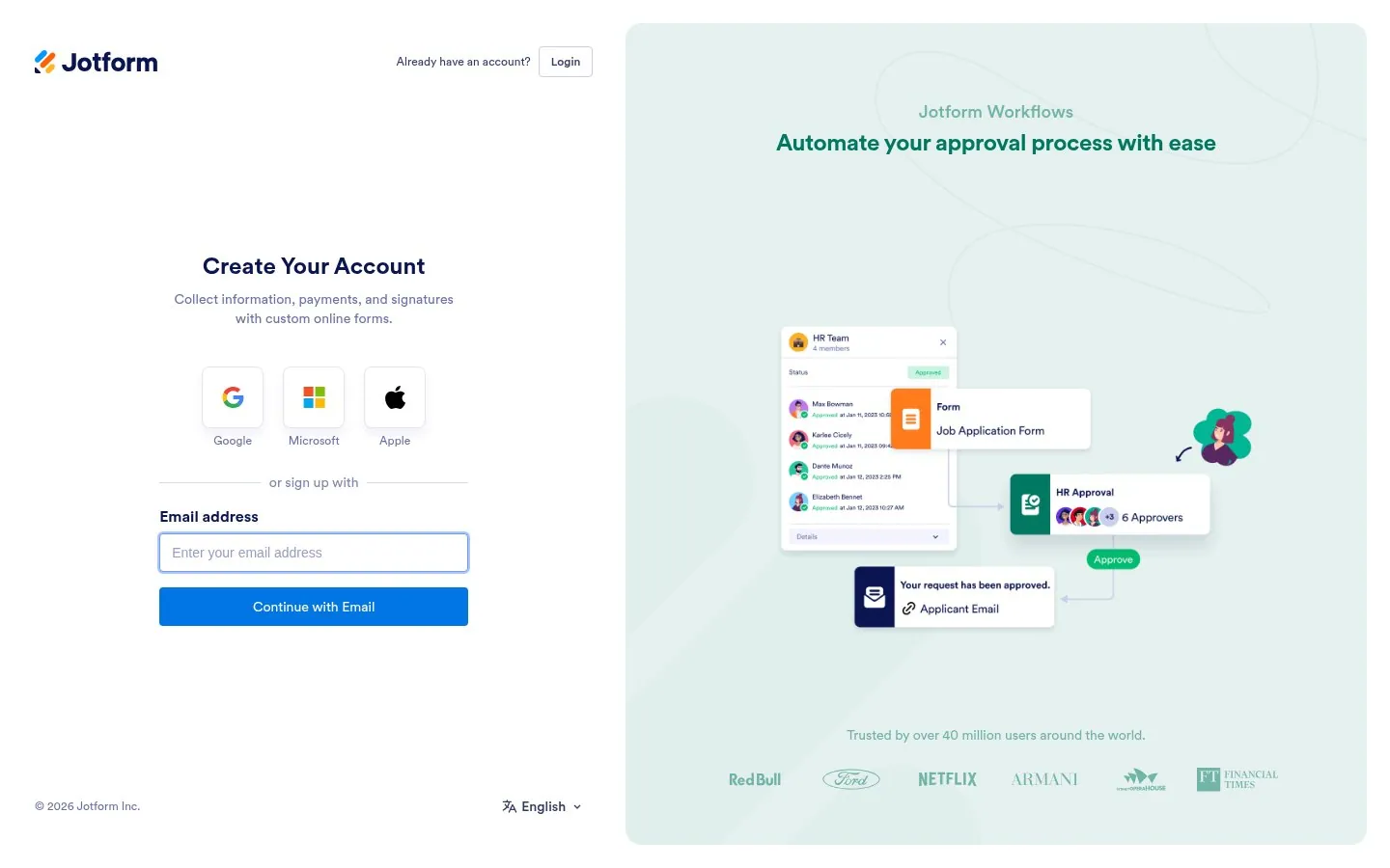
Jotform cycles through its product lines beside the form, each with Trusted by over 40 million users and logos like Red Bull and Netflix.
Screenshot jotform.com/signup, Oct 22, 2026 · How to copy it
 Todoist
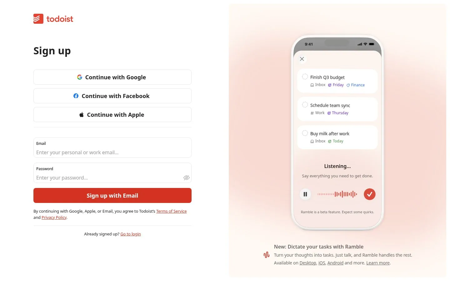
Todoist loops a phone demo of Ramble turning speech into tasks next to the signup buttons.
Screenshot app.todoist.com/auth/signup, Oct 22, 2026 · How to copy it
 Buffer
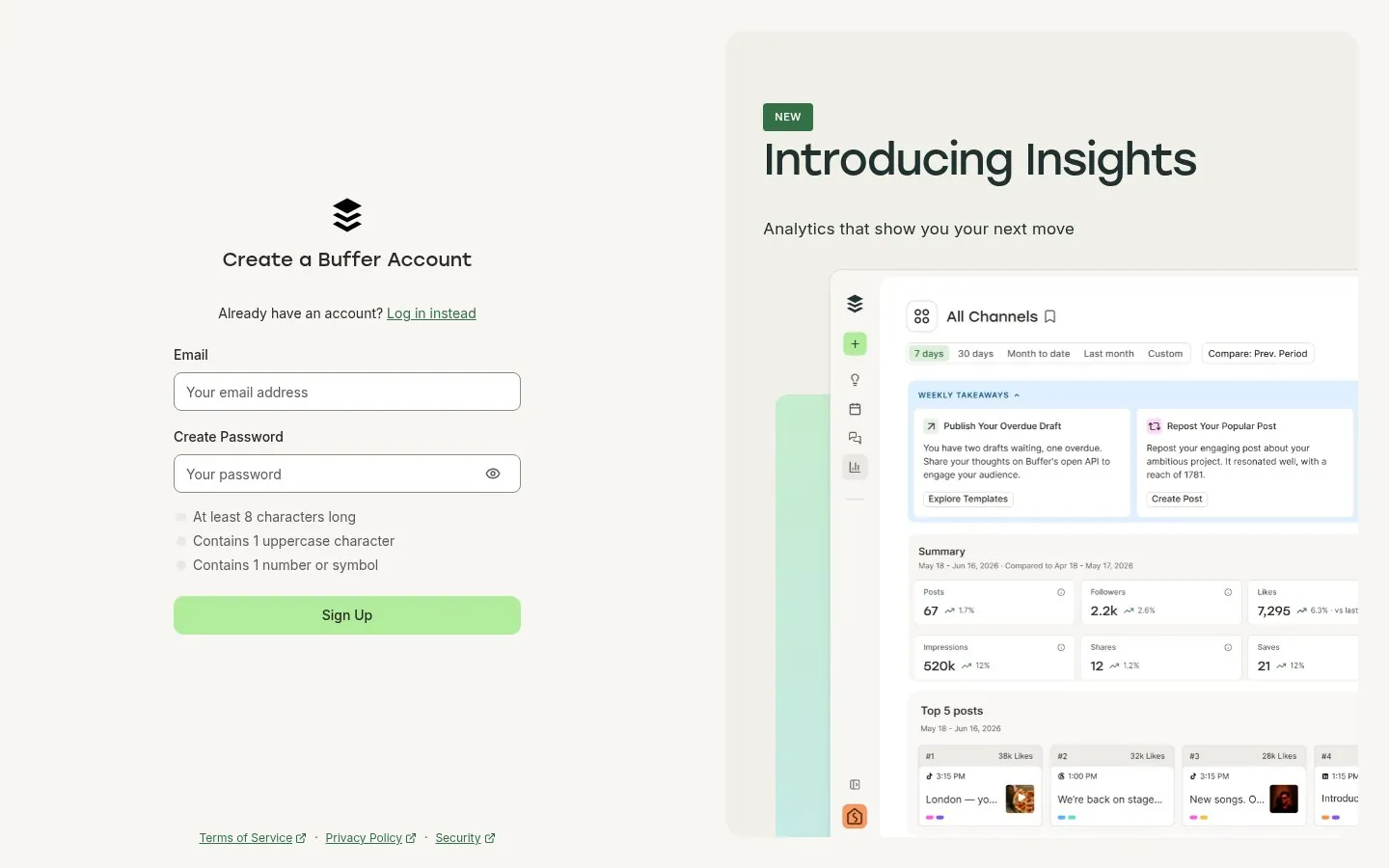
Buffer uses the side panel to announce Insights and shows password rules as a live 0 of 3 checklist.
Screenshot login.buffer.com/signup, Oct 22, 2026 · How to copy it
 Postman
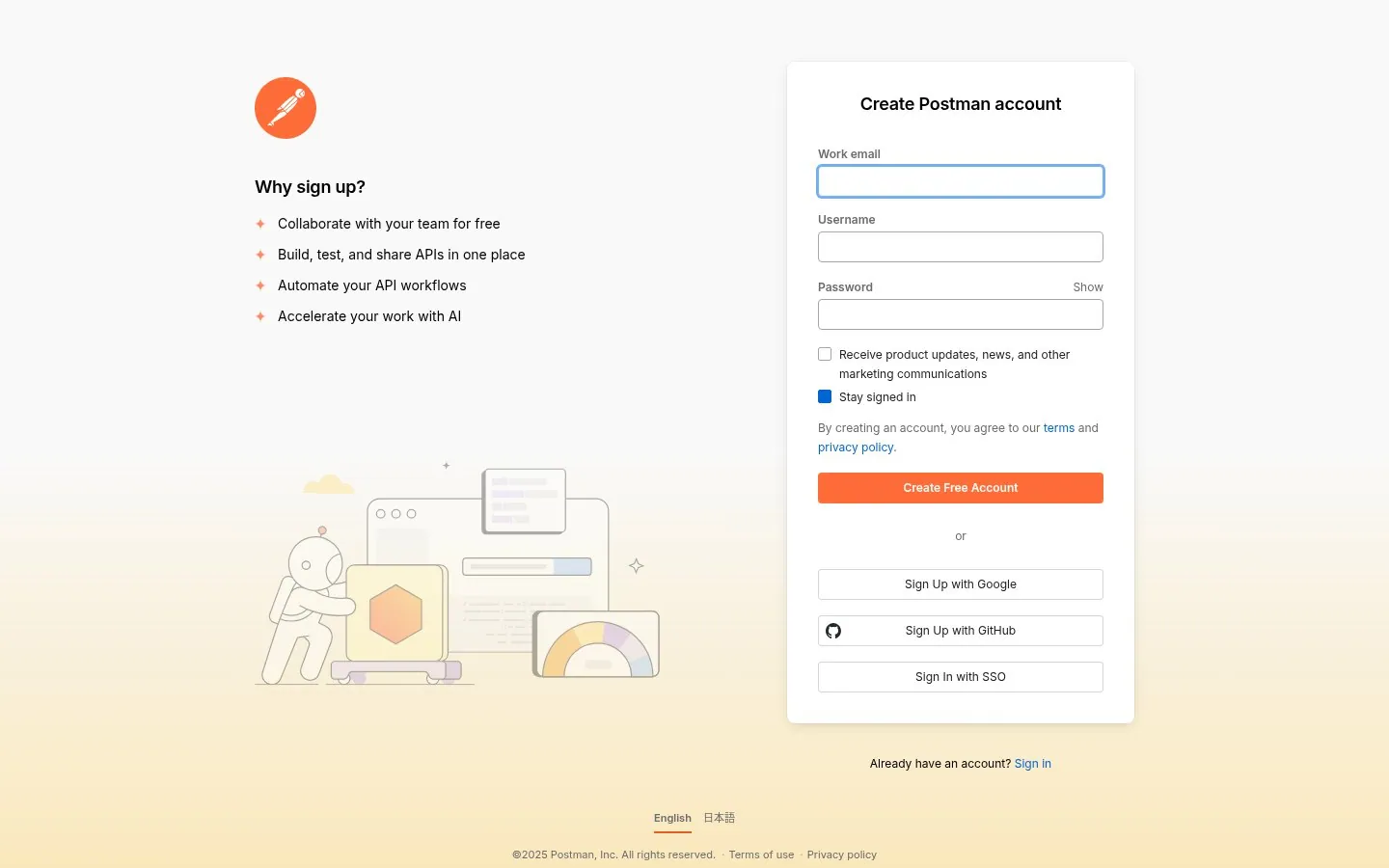
Postman answers Why sign up with four lines, starting with Collaborate with your team for free, beside the form.
Screenshot identity.getpostman.com/signup, Oct 22, 2026 · How to copy it
 MongoDB
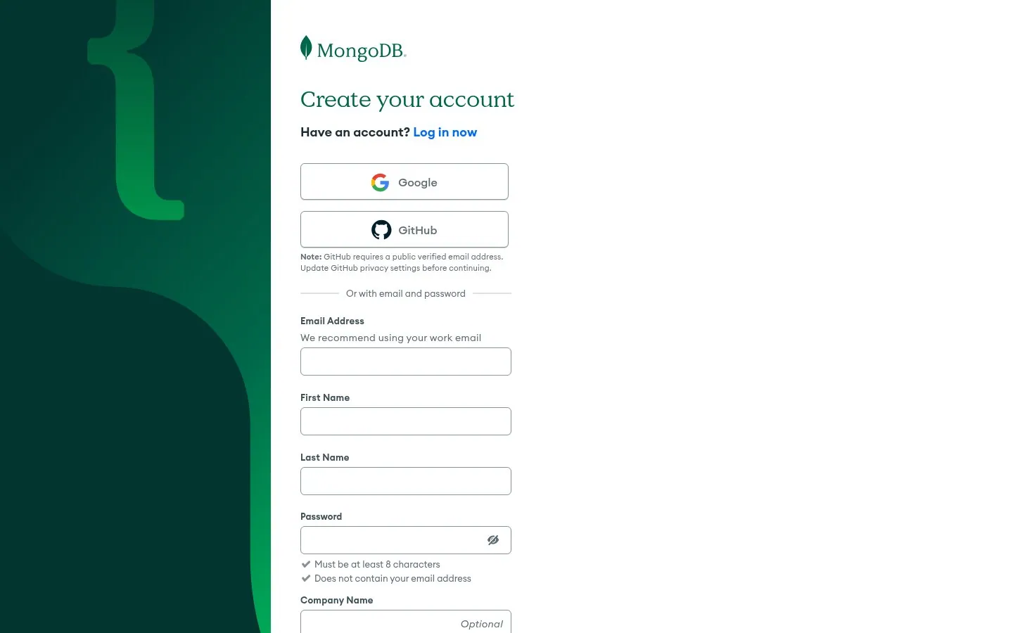
MongoDB warns that GitHub sign in needs a public verified email address and marks Company Name as optional.
Screenshot account.mongodb.com/account/register, Oct 22, 2026 · How to copy it
 Freshdesk
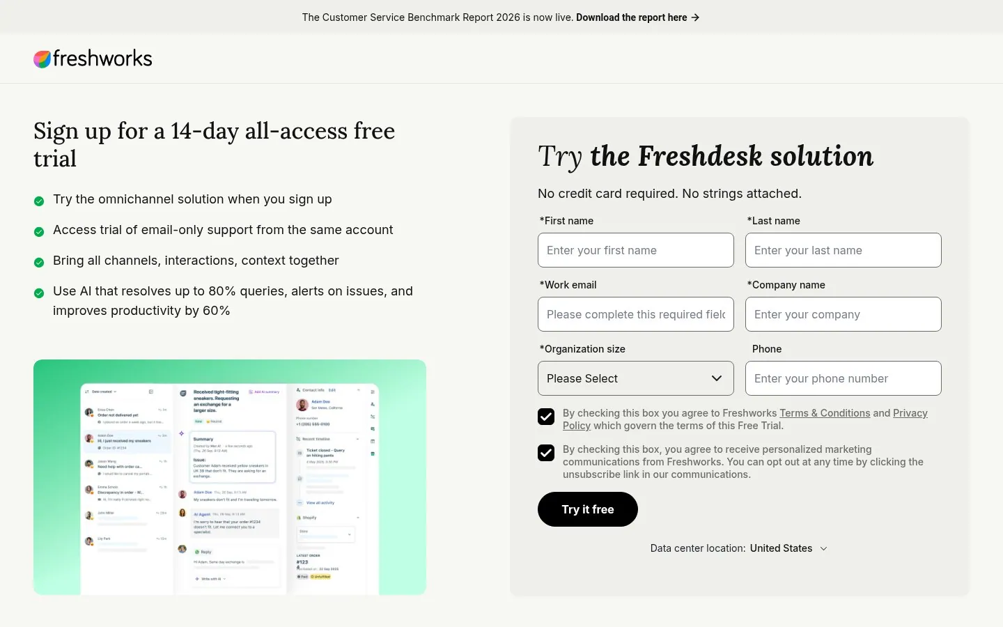
Freshdesk asks for six fields and backs them with AI that resolves up to 80% queries and No credit card required. No strings attached.
Screenshot freshworks.com/freshdesk/signup, Oct 22, 2026 · How to copy it
 MailerLite
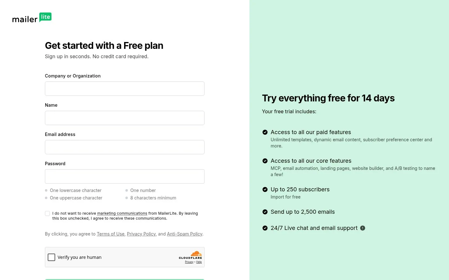
MailerLite starts every Free plan with Try everything free for 14 days and access to all paid features.
Screenshot accounts.mailerlite.com/signup, Oct 22, 2026 · How to copy it
 20 examples+15SaaS Signup Page ExamplesAsk for one field, answer the cost and time questions next to the button, and show the product or the result beside the form.
 22 examples


 +17Landing Page ExamplesSay what you are in a few words, show the real product, and give one clear next step.
 15 examples


 +4Paid Ad ExamplesLead with one number, one promise or one chore you remove, and match the words people search.
A short first step, ideally one email field plus Google or GitHub sign in, a line that says whether a card is needed and what happens when the trial ends, and something that sells the outcome beside the form, such as a product view, a result or a customer quote. Klaviyo asks for one field, Sentry says the trial drops to a free plan, and Semrush shows 2x organic traffic growth for new users.
As few as the first step allows. Klaviyo, Zendesk, Shopify, Wrike and Pipedrive all start with a single email field and ask the rest later. Sales led trials like Freshdesk ask for six fields and back them with hard numbers next to the form.
Most of the brands here say no card up front, including Asana, Zendesk, Pipedrive, Wrike, Clerk, Freshdesk and MailerLite, and they say it right next to the button. If you skip the card, also say what happens when the trial ends, as Sentry and MailerLite do.
You get nine examples, each with one line on why it works.