Real marketing from startups and B2B SaaS brands that is working right now, picked by hand.
Nine real screenshots of startup and B2B marketing
One line on why each one works
What to steal for your own product
A link to the source for every example
Check your inbox
Click the link we just sent to confirm your email.
Free. Unsubscribe in one click.
SaaS comparison page examples that win the rival search
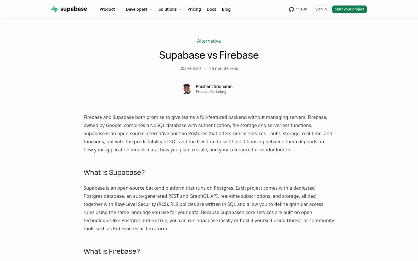
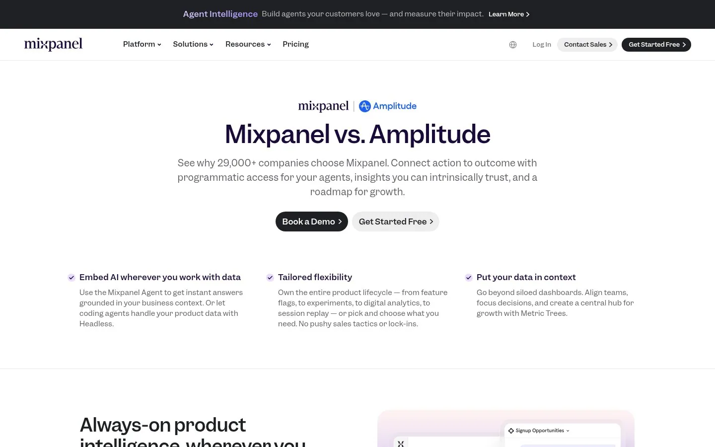
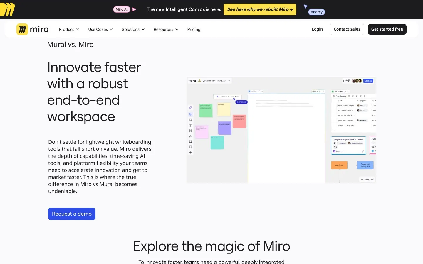
A good SaaS comparison page names the rival in the headline, gives a short and fair answer on who each tool fits, and backs its own side with a number buyers can check. The twelve X vs Y and switch pages below come from Zapier, Intercom, Rippling, Notion, Atlassian, Webflow, Framer, PostHog, Supabase, Mixpanel, Miro and Linear. All were captured Oct 22, 2026, and each links to the live page.
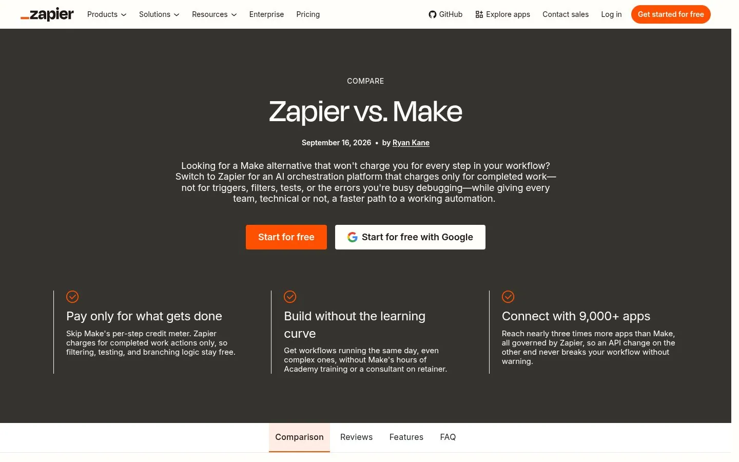
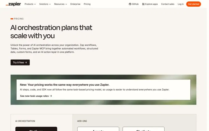
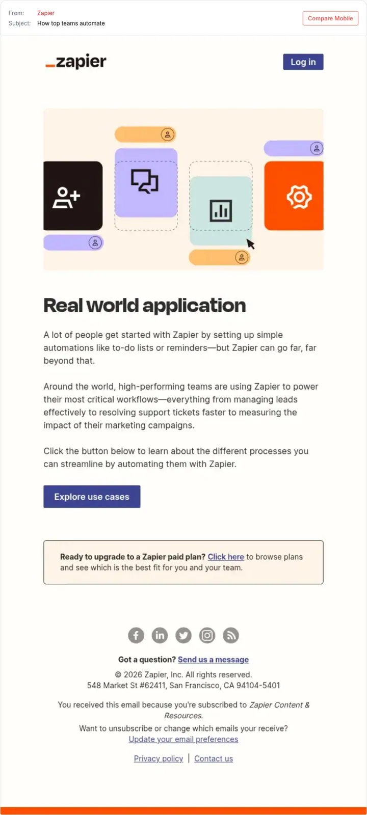
Zapier's page opens with Looking for a Make alternative that won't charge you for every step in your workflow. It attacks the rival's pricing model and states Zapier's own rule, pay only for completed work.
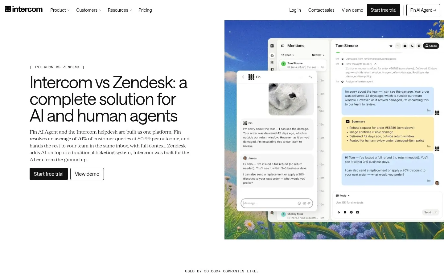
Intercom says Fin resolves an average of 76% of customer queries at $0.99 per outcome, and that Zendesk adds AI on top of a traditional ticketing system. Hard numbers sit right next to the rival's name.
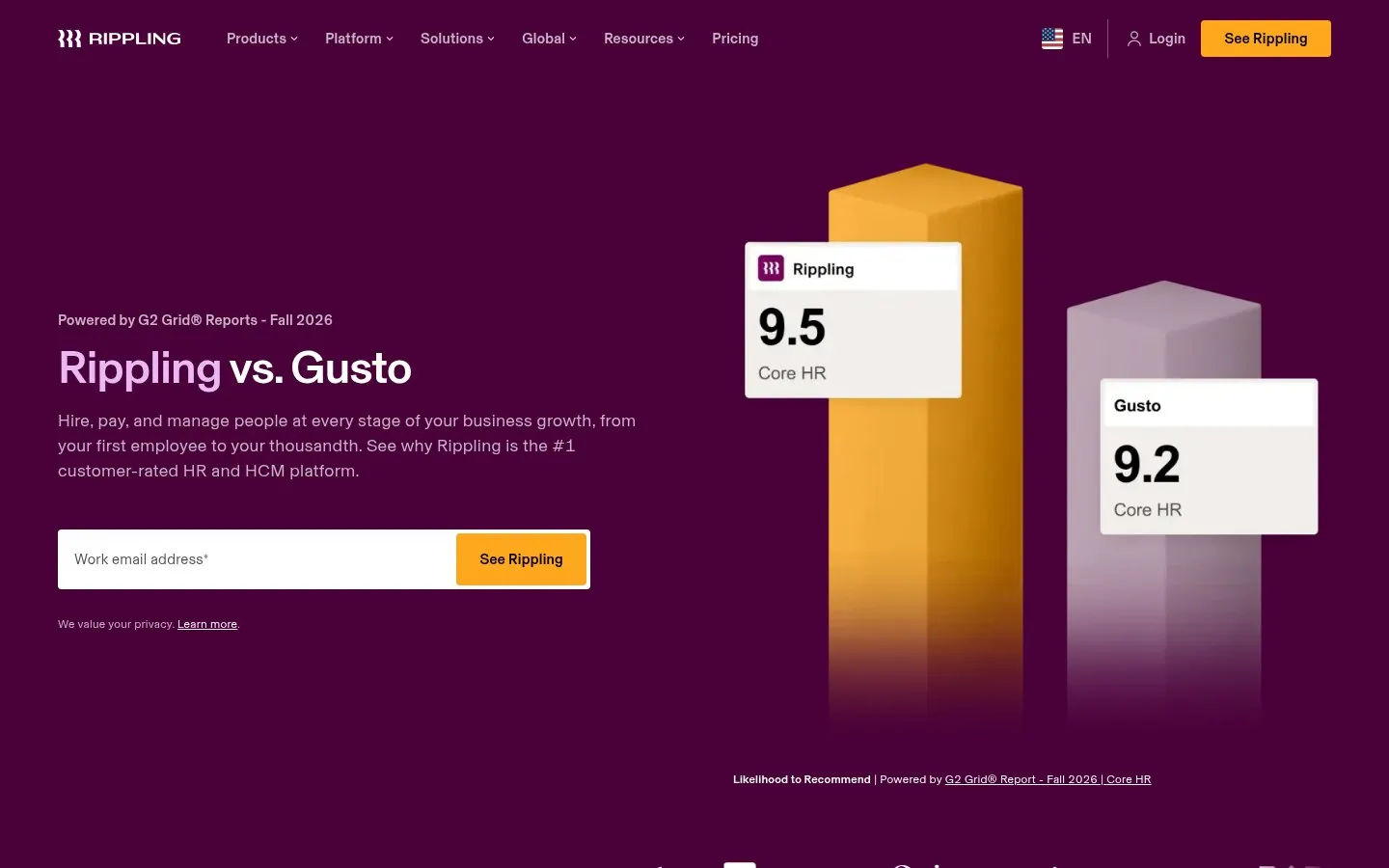
Rippling shows G2 Fall 2026 Core HR scores in the hero, 9.5 for Rippling and 9.2 for Gusto, next to a work email field. A third party score makes the claim feel neutral.
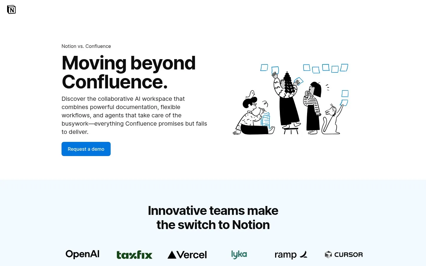
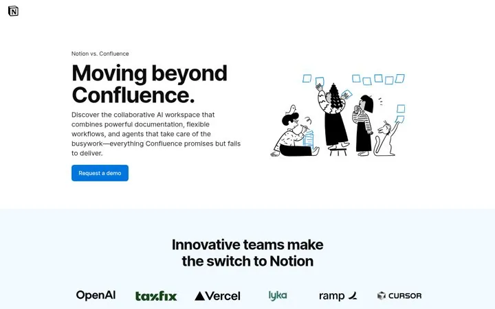
Notion's headline is Moving beyond Confluence, and a later section names the stack teams juggle, Confluence, Jira, Trello, Rovo and Loom. Switching reads as progress, not risk.
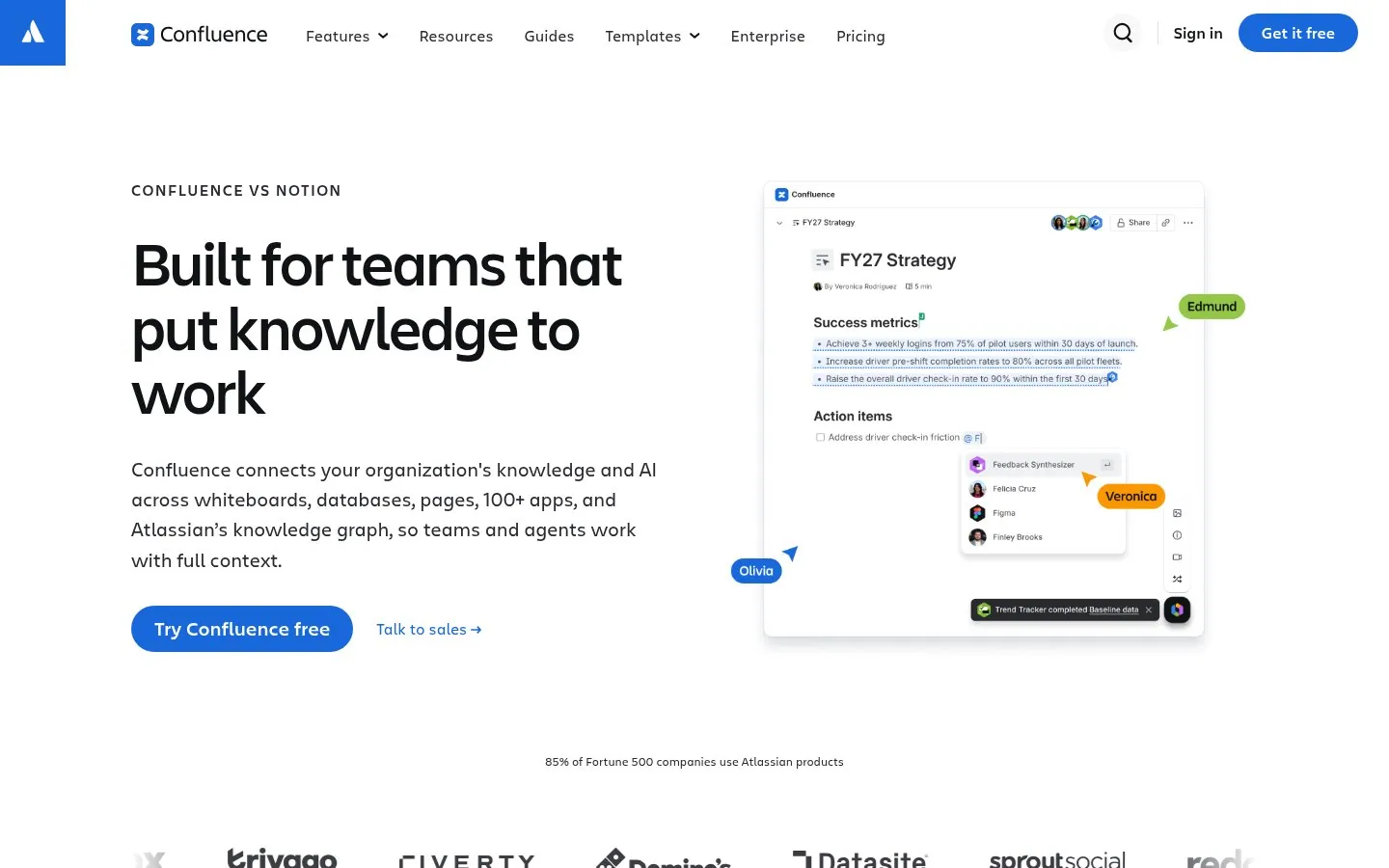
Atlassian answers with Built for teams that put knowledge to work, and its meta description calls Notion a notetaking workspace for quick thoughts. It casts the rival as the lighter tool.
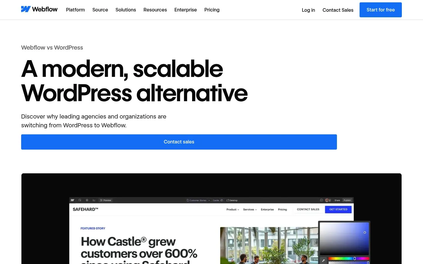
Webflow's headline is A modern, scalable WordPress alternative, the exact phrase unhappy WordPress users search. The copy then names the hidden cost of engineering time.
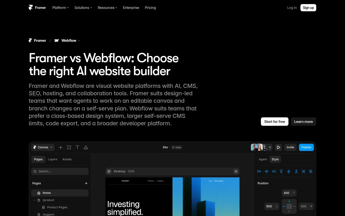
Framer opens by saying which teams fit each tool, including where Webflow wins, and adds a section titled Framer or Webflow the short answer. That is the line an AI answer can lift.
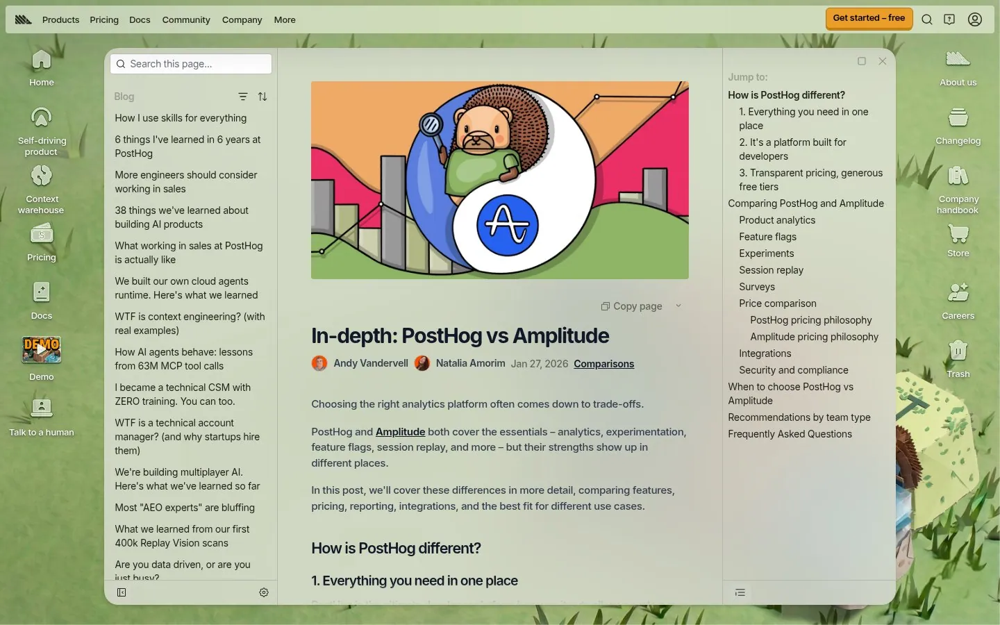
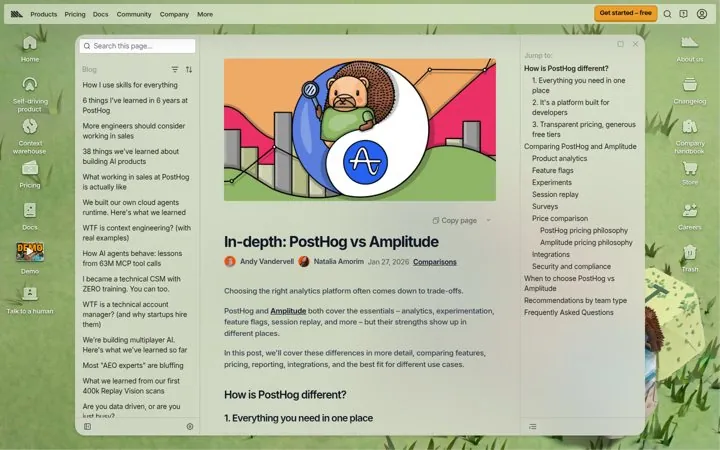
PostHog's in-depth page compares analytics, feature flags, A/B testing and pricing, then has sections on when to choose each tool and picks by team type.
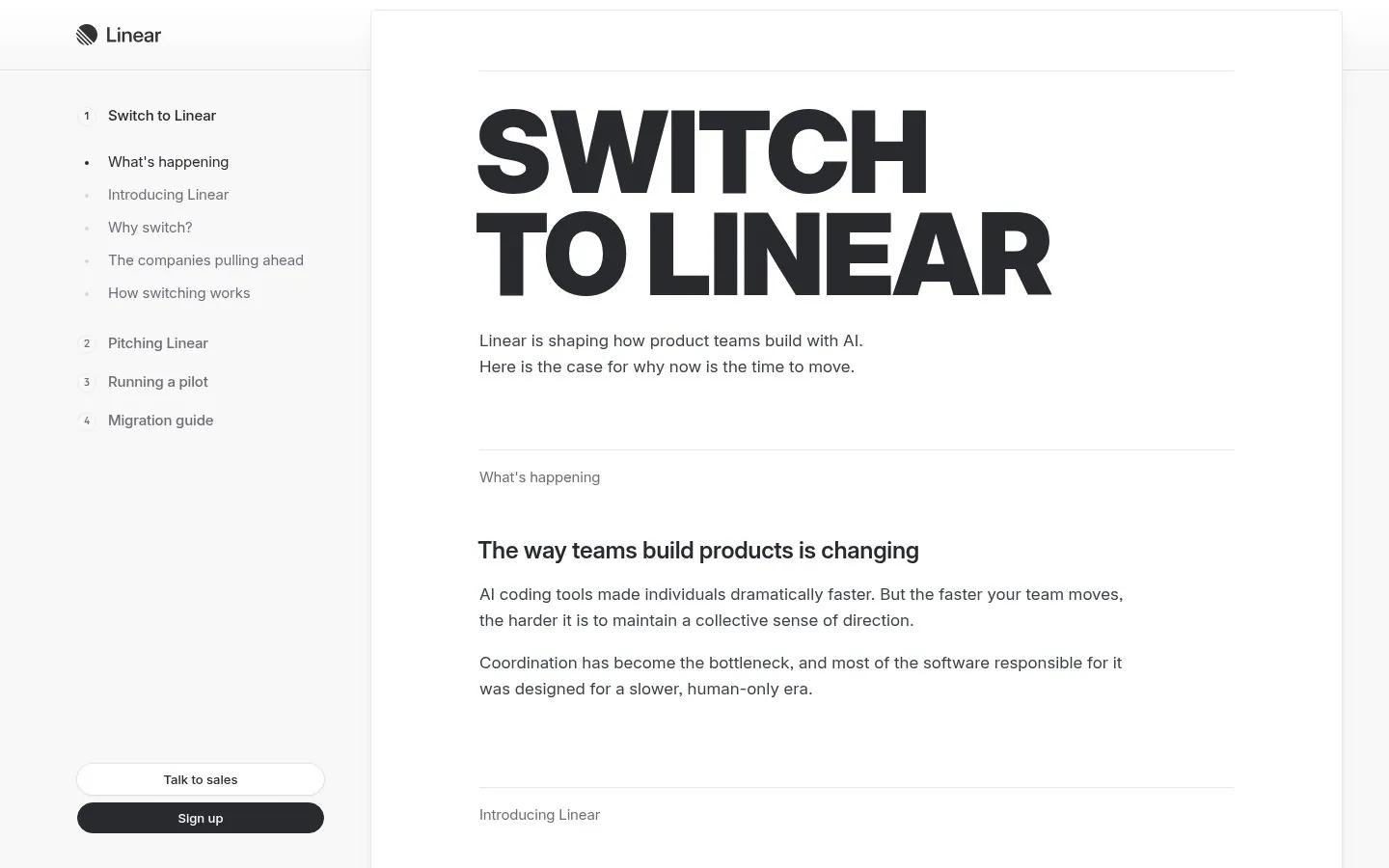
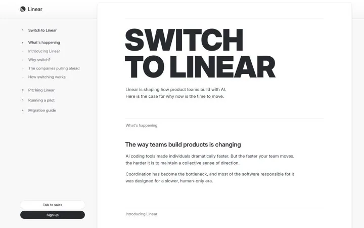
Linear's Switch to Linear page skips the feature table. It gives the champion chapters on why to switch, how to pitch Linear internally, how to run a pilot and how to migrate.
The rival name in the headline, a short answer on which teams each tool suits, a feature by feature section, one proof point such as a review score or customer count, and an FAQ. Framer opens with which teams fit Framer and which fit Webflow, and Miro ends with a Miro vs Mural FAQ.
Is it OK to name a competitor on your own website
Yes, most large SaaS brands do it. Notion and Atlassian each run a page about the other, and Zapier, Intercom, Rippling and Mixpanel all put the rival name in the page title. Keep every claim factual and checkable.
How do comparison pages help with SEO and AI answers
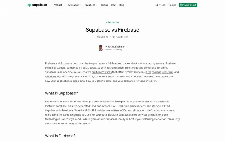
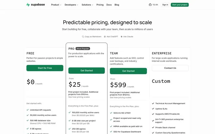
People search the matchup or the rival plus alternative, and those searches come from buyers close to a decision. Pages with a direct answer, clear headings and an FAQ, like Supabase vs Firebase and PostHog vs Amplitude, give search engines and AI answer engines text they can quote.
Related questions answered
One email every Monday
You get nine examples, each with one line on why it works.
 Zapier