 Linear
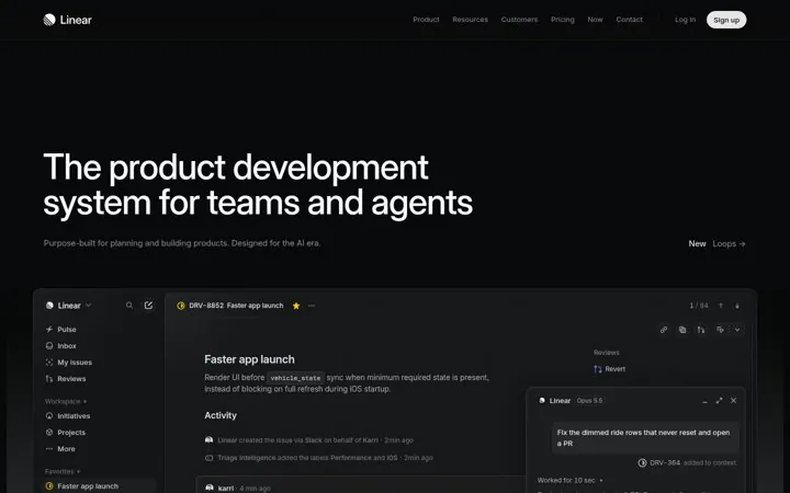
1. Name both users in your headline
Naming agents next to teams tells buyers the product fits how they work now.
- Name every kind of user in one line
- Show the real product under the headline
- Keep the sub line to one short sentence
The best SaaS landing page examples make one clear move and back it with proof. Our library has 12 real ones from Linear, Attio, Clay and others, each linked to the source. Common moves: name both users in your headline, welcome buyers to a new category and sell the system not the feature.
Updated · By Blake Emal · 12 real examples, each linked to its source
| Brand | Move | Why it works |
|---|---|---|
| Linear | Name both users in your headline | Naming agents next to teams tells buyers the product fits how they work now. |
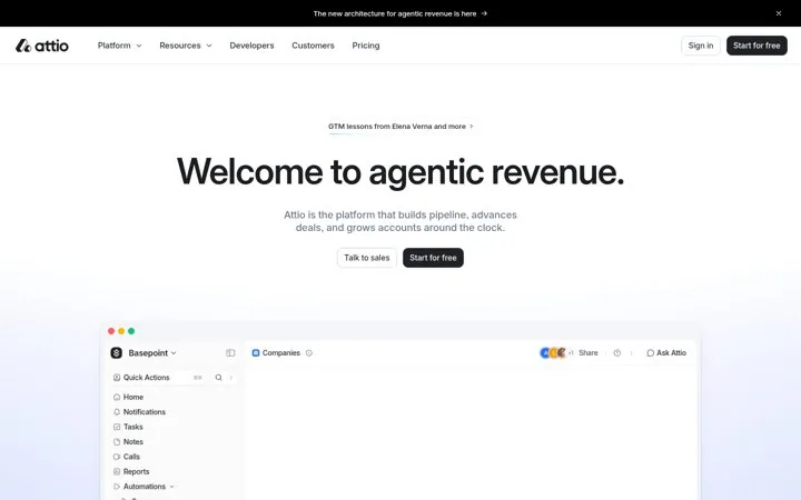
| Attio | Welcome buyers to a new category | A warm welcome to a new idea feels like an invite, not a pitch. |
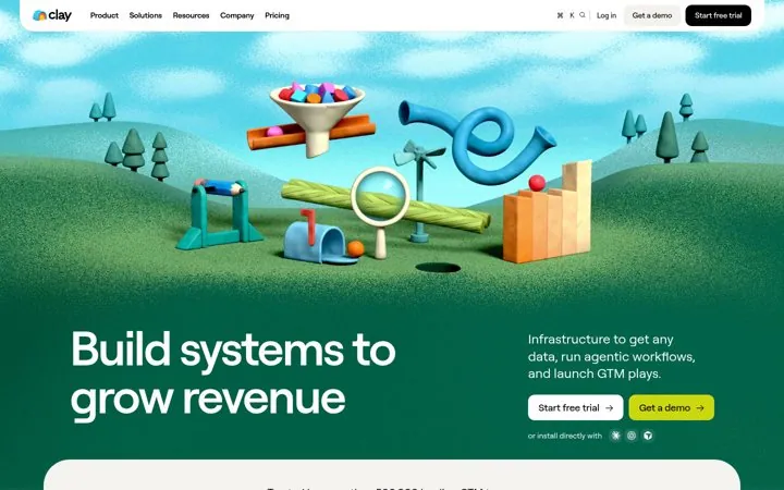
| Clay | Sell the system not the feature | Buyers picture an outcome machine instead of a list of tools. |
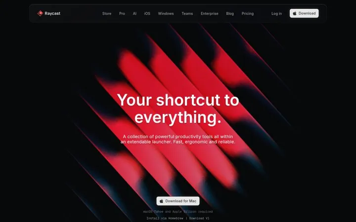
| Raycast | Promise one shortcut to everything | A single big promise and a single action make the choice easy. |
| PostHog | Show the free plan right in the hero | Removing price worry at the first glance gets more people to start. |
| Ramp | Turn a common saying into your headline | A phrase everyone knows becomes a promise people remember. |
| Retool | Answer the worry your buyers have today | Speaking to a fresh pain shows the product is current. |
| Superhuman | Promise help everywhere people work | One broad promise ties a whole suite together. |
| Loops | Show the customers right under the hero | Logos of known teams answer who uses this before anyone asks. |
| Mercury | Put the time to start in the hero | A clear time cost makes signing up feel small. |
| Notion | Put people and agents in one line | A rotating verb shows many uses without a long list, and naming agents makes an old category feel current. |
| Figma | Grow the category in your headline | Borrowing full stack from engineering tells buyers Figma now covers more of the build than design alone. |
LinearNaming agents next to teams tells buyers the product fits how they work now.
 Attio
A warm welcome to a new idea feels like an invite, not a pitch.
 Clay
Buyers picture an outcome machine instead of a list of tools.
 Raycast
A single big promise and a single action make the choice easy.
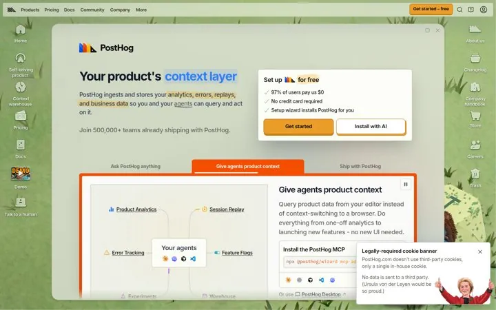
 PostHog
Removing price worry at the first glance gets more people to start.
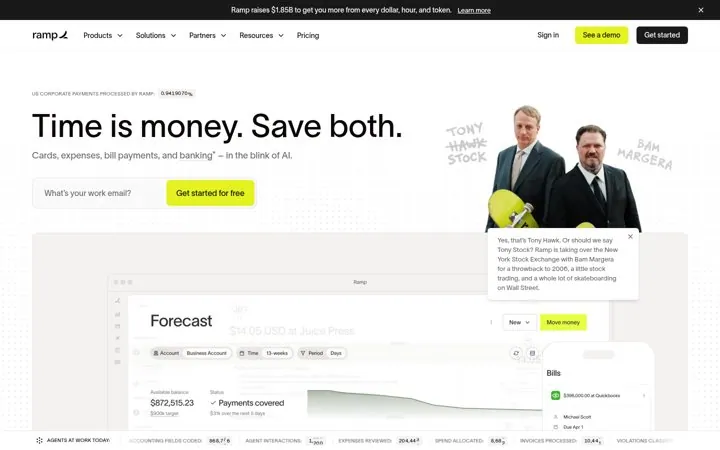
 Ramp
A phrase everyone knows becomes a promise people remember.
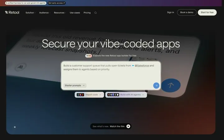
 Retool
Speaking to a fresh pain shows the product is current.
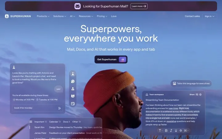
 Superhuman
One broad promise ties a whole suite together.
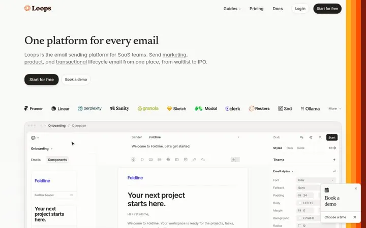
 Loops
Logos of known teams answer who uses this before anyone asks.
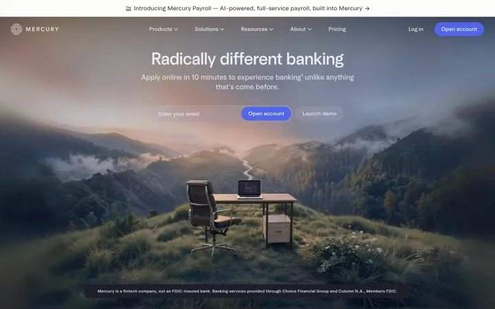
 Mercury
A clear time cost makes signing up feel small.
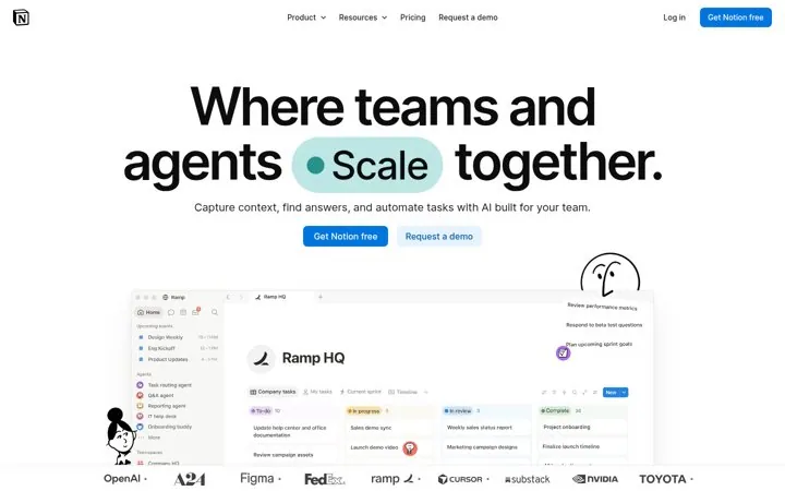
 Notion
A rotating verb shows many uses without a long list, and naming agents makes an old category feel current.
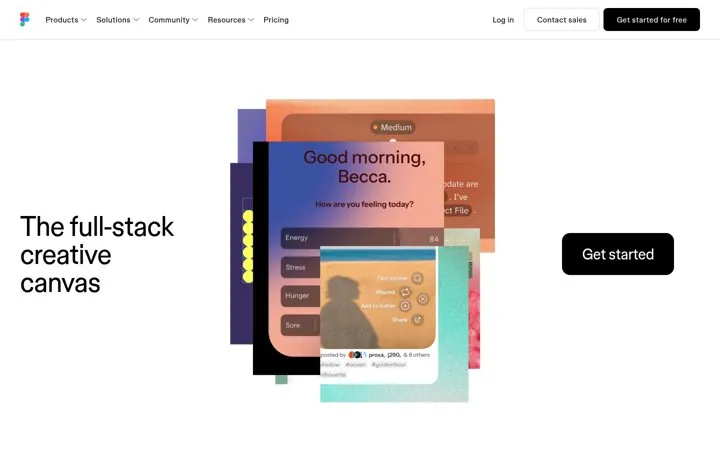
 Figma
Borrowing full stack from engineering tells buyers Figma now covers more of the build than design alone.
The best SaaS landing page examples make one clear move and back it with proof. Our library has 12 real ones from Linear, Attio, Clay and others, each linked to the source. Common moves: name both users in your headline, welcome buyers to a new category and sell the system not the feature.
Linear, Attio, Clay, Raycast, PostHog, Ramp, Retool, Superhuman, Loops, Mercury, Notion, Figma.
Each one is a public page, post, ad or email with a link to the source, captured by Today’s Marketing in 2026.